High-Converting Landing Pages: Anatomy & Design Rules
A landing page has one job and one visitor to convince. Here’s the anatomy that actually gets them there — and the design rules most pages quietly break.
 September 4, 2026
9 min read
September 4, 2026
9 min read
A high-converting landing page has a single goal, a headline that states the offer within seconds, one clear call to action repeated at the right points, and just enough proof and information to remove doubt — nothing more. Most underperforming pages fail not because of weak design, but because they try to do more than one job at once.
A homepage has to serve everyone: new visitors, returning customers, investors, job seekers. A landing page doesn’t. It exists for one traffic source, one offer, and one decision — which is exactly what makes it one of the highest-leverage pages on a site when it’s built correctly, and one of the most wasteful when it isn’t.
Most landing pages that underperform aren’t badly designed in the visual sense. They’re structurally confused — they try to explain too much, ask for too much, or give the visitor too many places to click. The anatomy below fixes that.
What Makes a Landing Page Different From a Homepage?
A homepage is a hub — it links out to everything a business offers, because it has to serve every kind of visitor. A landing page is a dead end by design: it has no main navigation, no distractions, and no path except forward toward the one action it was built for.
That single-mindedness is the entire advantage. A visitor who clicked an ad for a specific offer shouldn’t land on a page that also asks them to read the company’s history, browse unrelated products, or find their way through a menu. Every extra option on a landing page is a small tax on the conversion rate.
The Anatomy of a High-Converting Landing Page
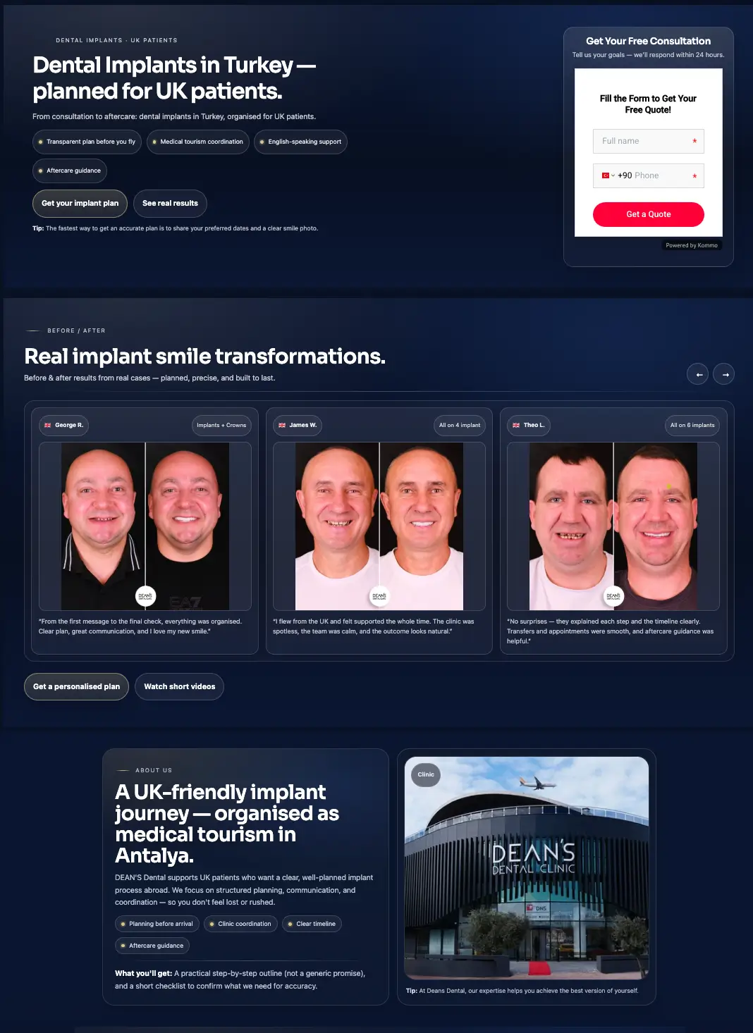
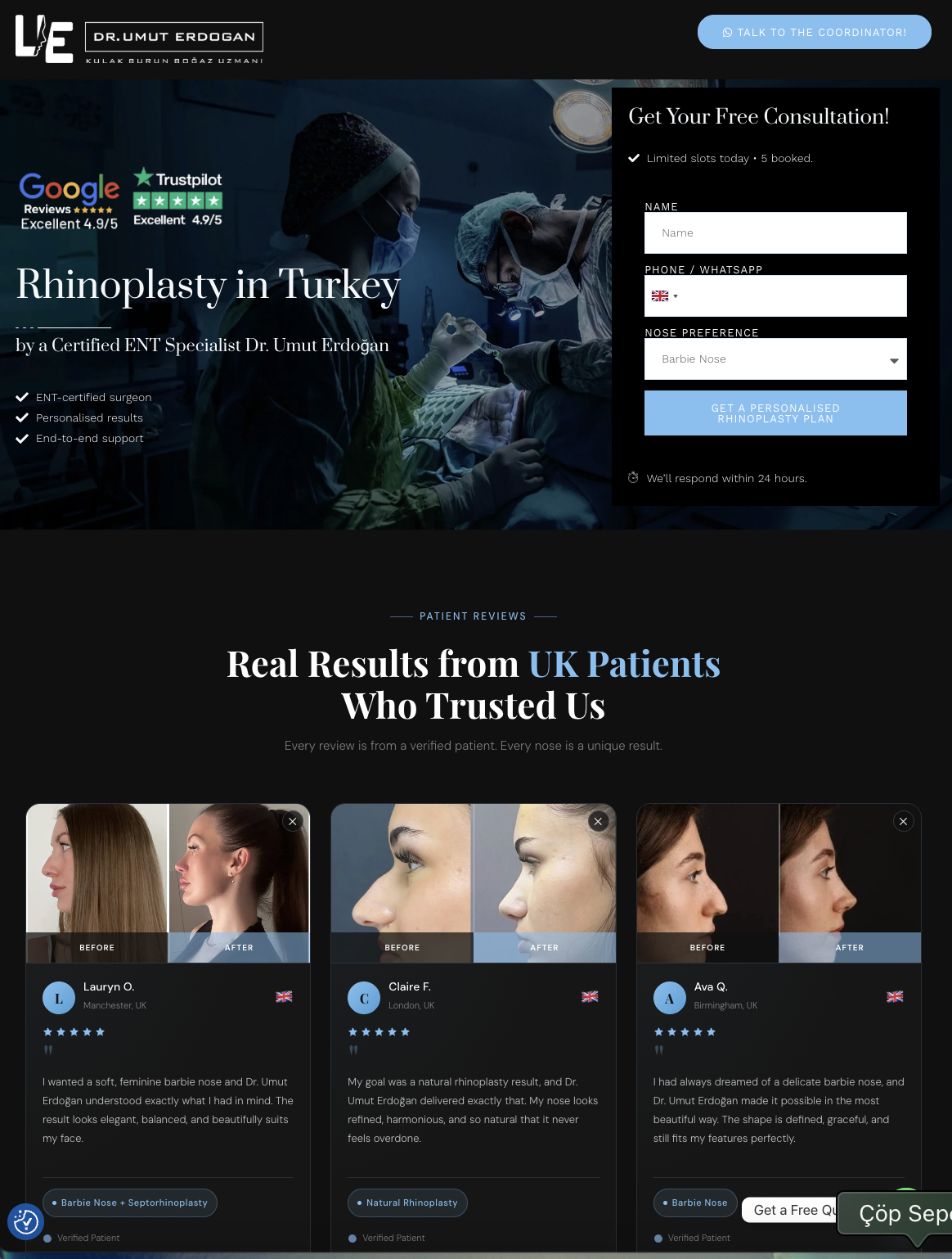
1. A headline that states the offer, not the brand
The headline has one job: make the offer and its value obvious within a few seconds, without requiring the visitor to scroll or think. “Welcome to our website” wastes that moment. “Get 3 quotes in under 2 minutes” doesn’t.
2. A subheadline that removes the first objection
Directly under the headline, the subheadline should answer the visitor’s next question — usually “how,” “for whom,” or “at what cost.” It’s the second sentence of the pitch, not a restatement of the first.
3. One primary call to action, repeated
A landing page should have exactly one primary action. It can appear more than once — after the hero, after the proof section, at the very end — but it should always say the same thing and lead to the same place. Multiple different CTAs split attention and measurably lower conversion.
4. Proof, placed where doubt naturally appears
Testimonials, logos, numbers, or case results work best positioned right after the claim they support, not gathered in one block at the bottom the visitor may never scroll to.
5. Just enough information, not everything
A landing page needs enough detail to remove hesitation — not a full explanation of the business. If a visitor needs a FAQ section to feel confident, that’s a signal the page above it isn’t doing its job yet.
6. A form or next step with the lowest possible friction
Every additional form field is a small reason to abandon. Ask only for what’s genuinely needed at this stage — the rest can be collected later in the relationship, not before it starts.
Design Rules That Consistently Lift Conversion
- Remove the main navigation. A landing page with a full site menu gives the visitor an easy way to leave before converting. Strip it down to the logo and, at most, one secondary link.
- Keep one visual focal point per section. A section with three competing visual elements forces the eye to choose. Every section should have one clear thing to look at first.
- Use contrast to guide, not decorate. The CTA button should be the highest-contrast element on the page, not one accent color among several equally loud ones.
- Write for scanning, not reading. Short paragraphs, bolded key phrases, and bulleted benefits let a visitor extract the offer in seconds. Dense paragraphs get skipped, not read.
- Match the message to the traffic source. A visitor arriving from a specific ad should see language that matches that ad’s promise word-for-word in the headline — a mismatch here is one of the fastest ways to lose someone in the first two seconds.
One page, one goal, one action.
The landing pages we see underperform almost always have the same root cause: they’re trying to be a homepage. Strip the page down to the one thing it’s actually meant to do, and conversion usually follows.
Common Landing Page Mistakes
- Leaving the main navigation in place. It gives visitors an exit before they’ve seen the offer.
- Multiple competing calls to action. “Buy Now,” “Learn More,” and “Contact Us” on the same page force a decision the visitor didn’t come to make.
- A headline that describes the company instead of the offer. Visitors don’t need to know who you are in the first five seconds — they need to know what’s in it for them.
- Asking for too much, too soon. A ten-field form on a cold-traffic landing page is a conversion killer; a two-field form isn’t.
- Treating mobile as an afterthought. Since the majority of landing page traffic increasingly arrives on mobile, a page that was only “checked” on mobile after being designed for desktop usually shows it in the numbers.
Real Landing Pages We’ve Built
The anatomy above isn’t theoretical — it’s how we structure every landing page we build for health tourism and clinic clients. A few recent examples, each built around a single offer and a single action:
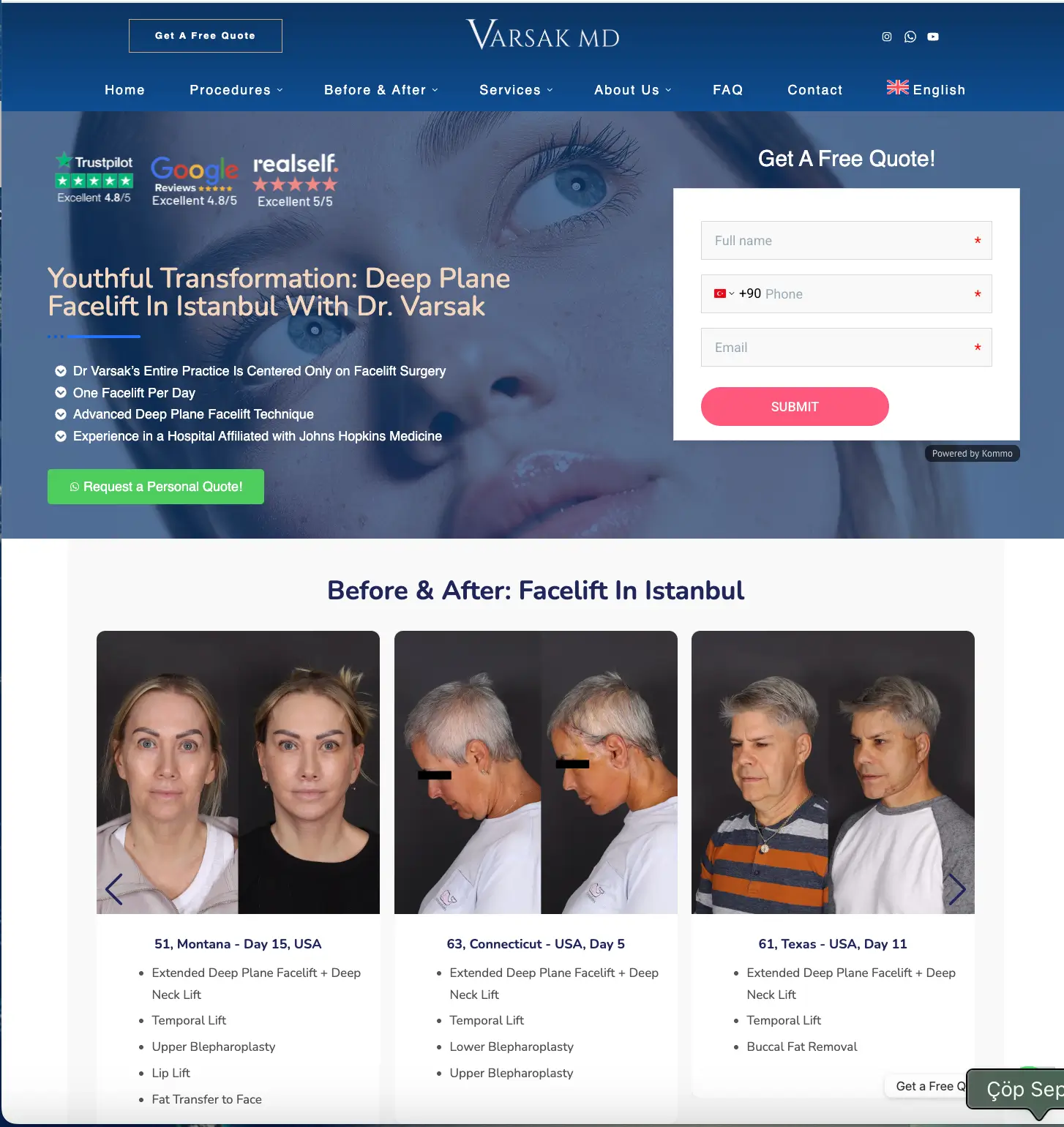
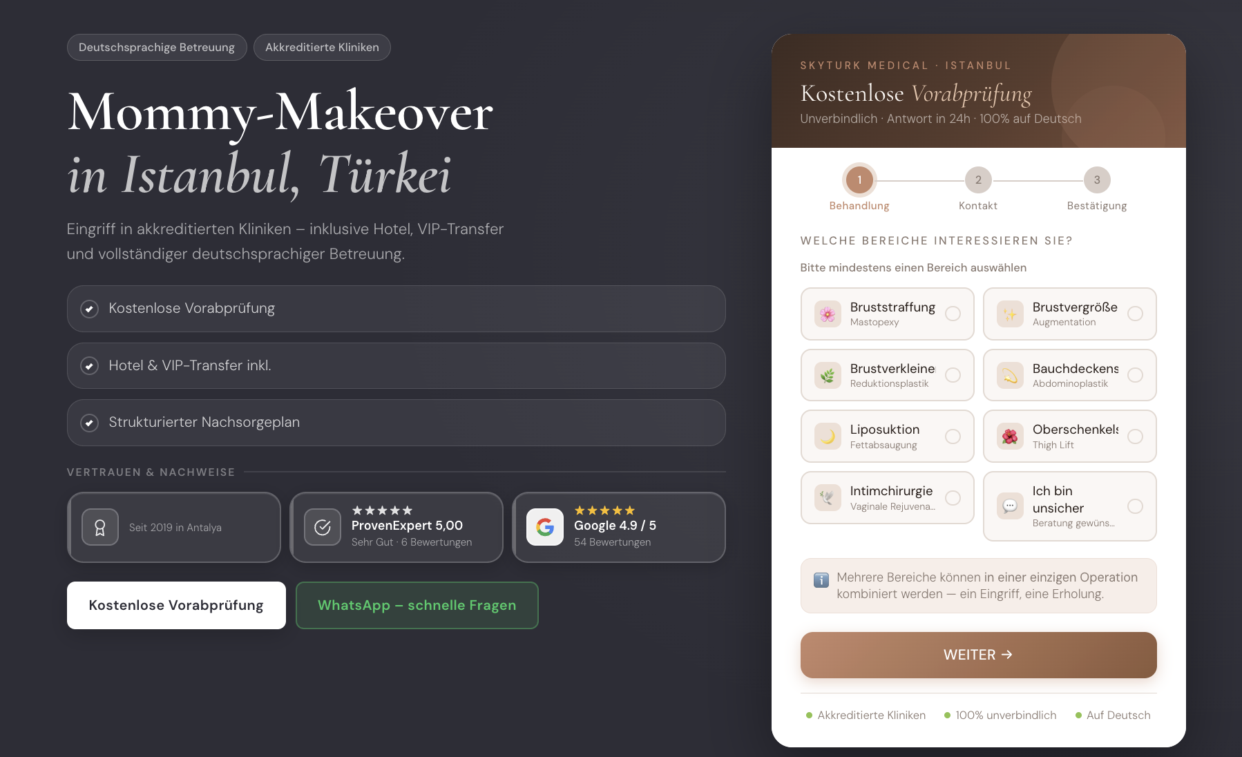
Mobile-First Isn’t Optional
A landing page built for desktop and adjusted for mobile afterward tends to carry over problems that don’t exist on a small screen: buttons too small to tap accurately, forms that require excessive scrolling, and hero sections that push the offer below the fold. Designing mobile-first — starting from the smallest, most constrained layout and expanding outward — tends to produce cleaner, more focused pages even on desktop, because it forces every element to earn its place.
Frequently Asked Questions
What’s the difference between a landing page and a homepage?+
How long should a landing page be?+
Should a landing page have more than one call to action?+
Does removing the navigation menu really improve conversion?+
How many form fields should a landing page have?+
Need a landing page that actually converts?
We design and build landing pages around one goal at a time — clear anatomy, the right proof in the right place, and a single action the visitor can’t miss.
Explore Web & Graphic Design →
Designs and structures landing pages at RTN House with a focus on conversion-first layout — building pages that guide a single visitor toward a single action, without losing them along the way.


